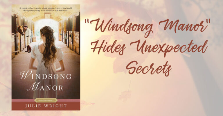
“Windsong Manor” Hides Unexpected Secrets
Publisher Summary A young widow. A gentle stable master. A secret that could change everything. Will Nora dare risk her heart? The London Countryside, 1820 Eleanora Coventry comes from a…
Publisher Summary A young widow. A gentle stable master. A secret that could change everything. Will Nora dare risk her heart? The London Countryside, 1820 Eleanora Coventry comes from a…

Publisher’s Summary From artisan breads, savory soups and sandwiches to delectable desserts, a close-knit family has perfected the art of baking and serving their community over the course of twenty-five…

Merry Christmas! Ok, so I’m a little early. But it’s not too early to start shopping for this year’s Christmas Book. I’m not a big Christmas collector, but I do…
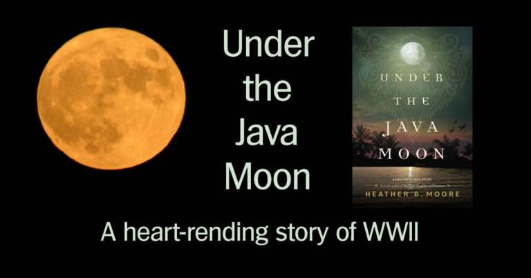
Publisher’s Summary Based on a true story, this gripping WWII novel captures the resilience, hope, and courage of a Dutch family who is separated during the war when the Japanese…

Publisher’s Summary This beautiful, cloth-covered hardcover collector’s anthology compiles all the penny dreadful short stories from Sarah M. Eden’s five-book Victorian romance series. Included in this edition are three new,…
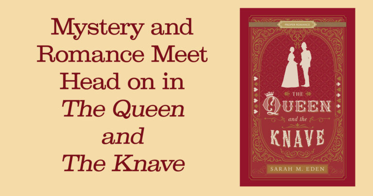
Publisher’s Summary London, 1866 Móirín Donnelly has spent the last five years working in the shadows for the Dread Penny Society, but spending so much of her life in secret…

Gonzo Capitalism Publisher’s Summary The traditional ways of earning a living are outdated, if not outright rigged. That’s why a growing number of enterprising individuals are instead turning to the…

It’s that time of year again—Back-to-school. A time many parents simultaneously anticipate and dread. After a summer of fun, work, and play with your kids, it’s time to get back…

Do you have a current photography portfolio? Do you know what a portfolio is and why you need one? Your photography portfolio is a collection of your best work. It is…

Publisher’s Summary A free-spirited artist teams up with a no-nonsense detective to capture a thief who has stolen a priceless Michaelangelo painting. Manchester, England, 1857 Rosanna Hawkins is one of…